Thursday, 31 March 2016

Stir Magazine // Final drawings

Me and Alec corresponded about what I should draw, as he had multiple ideas, so I weighed in.


He had the idea of drawing an object related to each concept, and also the idea of illustrating some logos he came up with that would be for each of the co-ops.


We both seemed to agree about objects being a good idea.


From this image I collected the appropriate images for the others -

Specialist Equipment co-ops


 Car Co-ops


 Residential co-ops
the imagery is really simple and straightforward, but Alec's suggestion of colourful pencil drawings will bring them to life.


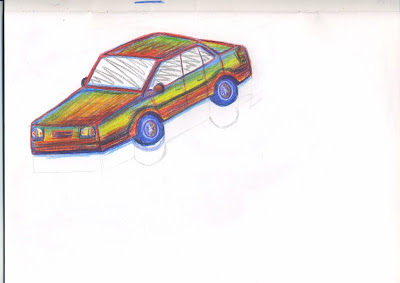
These cars are not quite up to the standard of the rest of the magazine, as they are scruffy etc - which can work, but I want to try and make something that I can use in my portfolio in the future.

I'm happier with this drawing,  - I've managed to fit in all the colours that I can to stick to the 'multicoloured' theme. It has a naive, cartoonish style but not so much that it looks childish.


This was incredibly tricky to draw because of the lighting and the reflections in the metal


I just drew the bed from my head, as a photograph wasn't needed. Shading the bed cover was pretty difficult, as I had to use an array of colours on such a simple detail.


This one is probably the best. I'm happy with all of them, though.


Monday, 28 March 2016

Stir Magazine // Research

Stir to Action is a community organisation that publishes a quarterly magazine, runs workshop programmes and short courses, produces how-to resources for setting up co-operatives and community enterprises, commissions original artwork and facilitates social economy start-ups.


I looked at some 'naive' style illustration of cars, as thats what I've struggled with drawing most:


Saturday, 26 March 2016

Live brief: Stir Magazine illustrations

Brief

Stir magazine: http://www.stirtoaction.com/ - magazine about alternative economics/cooperatives/community projects.

Article:
A3 spread on 4 types of co-ops that should exist (with very little copy).

The page will mainly be illustration but have a short introductory paragraph and around 100/150 words for each of the 4 types of co-op.


I have a few ideas, as I was initially going to attempt this one myself before I remembered I cant draw whatsoever, but you're free to do whatever really

Deadline would be in 2 weeks, so pretty short notice I know, but doesn't have to be anything overly complex

the copy is here:

The Co-Sharing Economy

So many markets today are dysfunctional, so many big businesses unethical or environmentally irresponsible, and even emerging so-called sharing economy models turn out to be exploitative and antisocial. Housing and health are in crisis. Our transport system is unsustainable. Meanwhile, we just keep on consuming ever more stuff. But could we dare to imagine alternative co-operative models emerging to make markets work better for citizens, for workers and for the planet? Can we develop models which share resources and profits and which reduce unnecessary waste? Here are four ideas to help us shift from competition that isn't working to co-operation that does.

Car Co-ops

Uber meets car clubs meets car pools meets the Rochdale principles. The fleet of cars are owned in common by the members who drive themselves from A to B and pay per mile. Other non-members can pay to use the cars too but at a premium. Insurance is arranged collectively, maintenance is managed centrally and members can access vans or trucks if they need them. Just check the app and see where the nearest car is parked. Overall car production and congestion is reduced and lazy car journeys made less frequent.
Those unable to afford to own a car can still access a vehicle when they need one. Profits are reinvested in growing the fleet and capturing more of the market.

Residential Co-ops

AirBnB meets timeshare meets co-housing meets house swaps. Homes are owned by members individually but occupancy can be negotiated. If your work doesn’t tie you down or indeed, if it moves you around, then spread your time around.
Fancy a week in Berlin? Need 6 weeks in Lisbon? Winter in London but Springtime in Paris? Then make your home available and earn the right to occupy someone else’s. No-one profits from the platform except the collective and you have to share out to share in.

Specialist Equipment Co-ops

HSS meets B+Q meets the library meets Heston Blumenthal. Need to cut some branches off a tree? Borrow a sound system for the party? Or a sander for the floor? Want to try, just once, cooking sous vide like on the telly? Members own a share of the stock and pay to borrow it or earn credit by contributing to the common pool. Borrowing luxury items cross subsidise the more essential tools. Non-members or non-contributors pay more.

Care Co-ops

Health and social care personal budgets meets mutuals. If you had your own personal health budget, where would you spend it? But what if you owned a share in a healthcare provider and stood to receive a dividend if it thrived? What then? And would you spend your budget if you didn’t really need to if the provider earned the saving? Would you forget to turn up for your appointments? What if the care provider you part owned stood to benefit if you took more responsibility for your own health?

I'm thinking one of these three concepts could work:

1. Design logos for the companies, then convert them into painted images (made a start on this already so could sent you early stages of what I had)
2. Illustrate either a row of shop fronts or 4 separate buildings (preferably on the same plain of perspective) each one showing one of the different co-ops
3. Illustrate an item associated with the co-op, eg. health - stethoscope, equipment - tool of some kind, residential - bed, vehicle - car or map

but as I said these are just guidelines

Hey, don't know if you've had any time to think about it yet. but though I'd send over a more firm idea of something you could go with. Think the idea of painting objects would be pretty strong, but could be done nicely in paint or coloured pencil. Might be nice to do them all multicoloured. Can also be fairly sort of 'naive' styled.

Friday, 25 March 2016

Leeds Print Festival // Print research

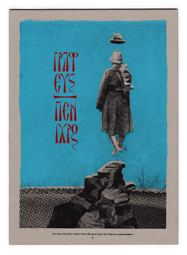
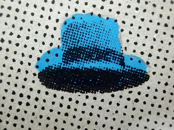
I have looked at many different unique outcomes due to traditional print.


Risotto Studio
http://shop.risottostudio.com/collections/prints/products/february-graphic-print


Popolo Press
http://www.popolopress.com/


The Smallest Printing Company
http://letterproeftuin.com/letterproeftuin-chaumont-2013.html


Annie Strachanl: Untitled
http://www.anniestrachan.co.uk/


RAINBOW
https://www.behance.net/gallery/35007629/HOLOB-FAMOUS-IN-SUWALKI-poster


https://www.behance.net/gallery/14087723/Mind-Mash


https://www.behance.net/gallery/17504107/The-Constitution-of-Moir-Silkscreen-Print


The Constitution of Moiré

Within the printing business, the moiré effect is mostly considered to be an unwanted effect. This is true, but only regarding the way it is created and used. In some applications, it can be extremely interesting, from an aesthetic point of view. In this study, the manual experimentation on the rotation and placement of the line art and the variation of color produce a feast for the eyes, lively patterns that move and alter as the viewer changes position across them.

https://www.behance.net/gallery/34609279/Blessed-or-Cursed-Silkscreen-Poster-T-shirt


https://www.behance.net/gallery/20589817/Weapons-of-Mass-Destruction-silkscreen-print


https://www.behance.net/gallery/19249527/The-One-That-Got-Away


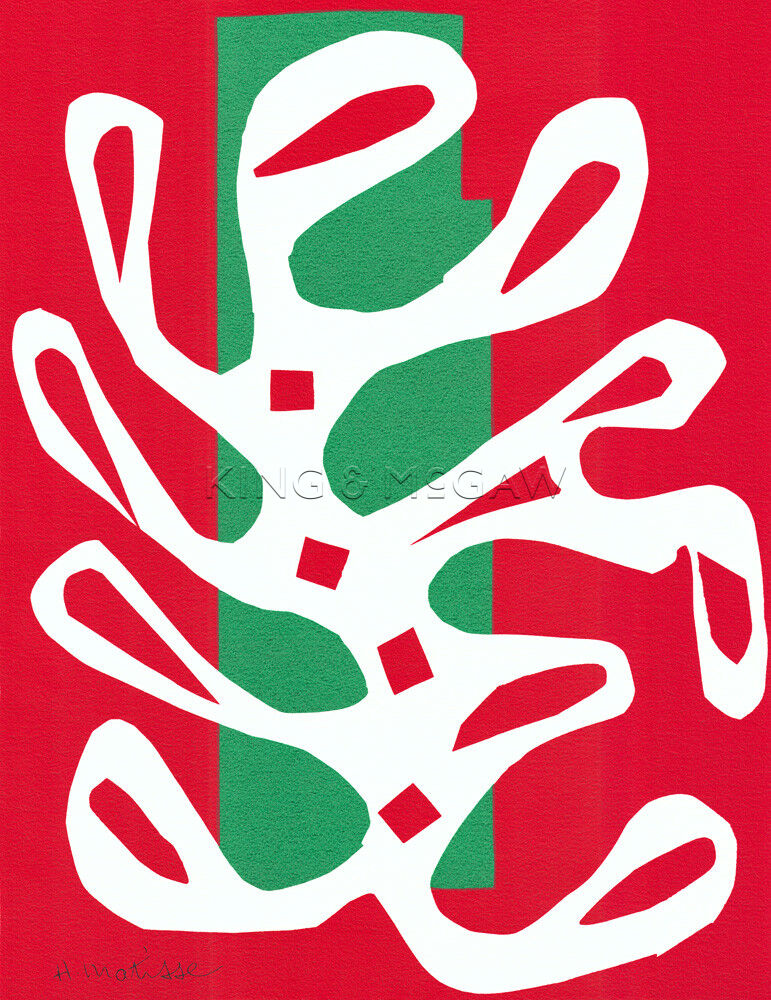
Matisse style