What was successful?
By working through and completing this module, I have learnt a lot about my own ability and have noticed how my professionalism as a designer has improved vastly since first year. My time management has gotten a lot better, I can finish work without rushing to finish.
In terms of final outcome, I have really raised my confidence in printing, as I have never been to digital print for an independent project before.
What have I learnt?
I experimented with different types of stock depending on what I was printing, which helped me learn which works best depending on the context.
Each brief has had its own learning curve for me, such as branding, web design, and advertisement. Each of these have taught me how to be a specialist when I need to be, as I have never worked on each of these for an elongated period before.
I have improved on design boards as in past modules I have not done many of them for each brief. I made sure to give myself more time at the end of my projects to do them.
What would I do differently?
I would try to have more crits as I didn't get that much feedback throughout this module. I would also take more time to sketch out more initial ideas before getting too confident about one idea.
I would give myself even more time to complete design boards as I feel that I rushed them for this module.
In the next module...
I would like to experiment more with print finishes, such as embossing or foiling which I haven't tried before. Through this module I have become more professional and I would like to extend this into the next module by working on these strengths.
Friday, 9 January 2015
Monday, 5 January 2015
OUGD504 // Studio Brief 04: Leaflet and magazine ad development


QR code - interactivity

I created a QR code that hypothetically would link to a certain page on the website in reference to some trivia on the advertisements.
I then tried out using my paint images as a fill for the code.


I have chosen to use the one on the right, as the colours are suiting and its clear what it is.
Saturday, 3 January 2015
OUGD504 // Studio Brief 04: Poster development
Initial ideas:
- use snippets of each movement in images
- dappled paintstrokes as background
- marbling
- use paint effects in the style of the artwork
- thick paint brushstrokes
- watercolour

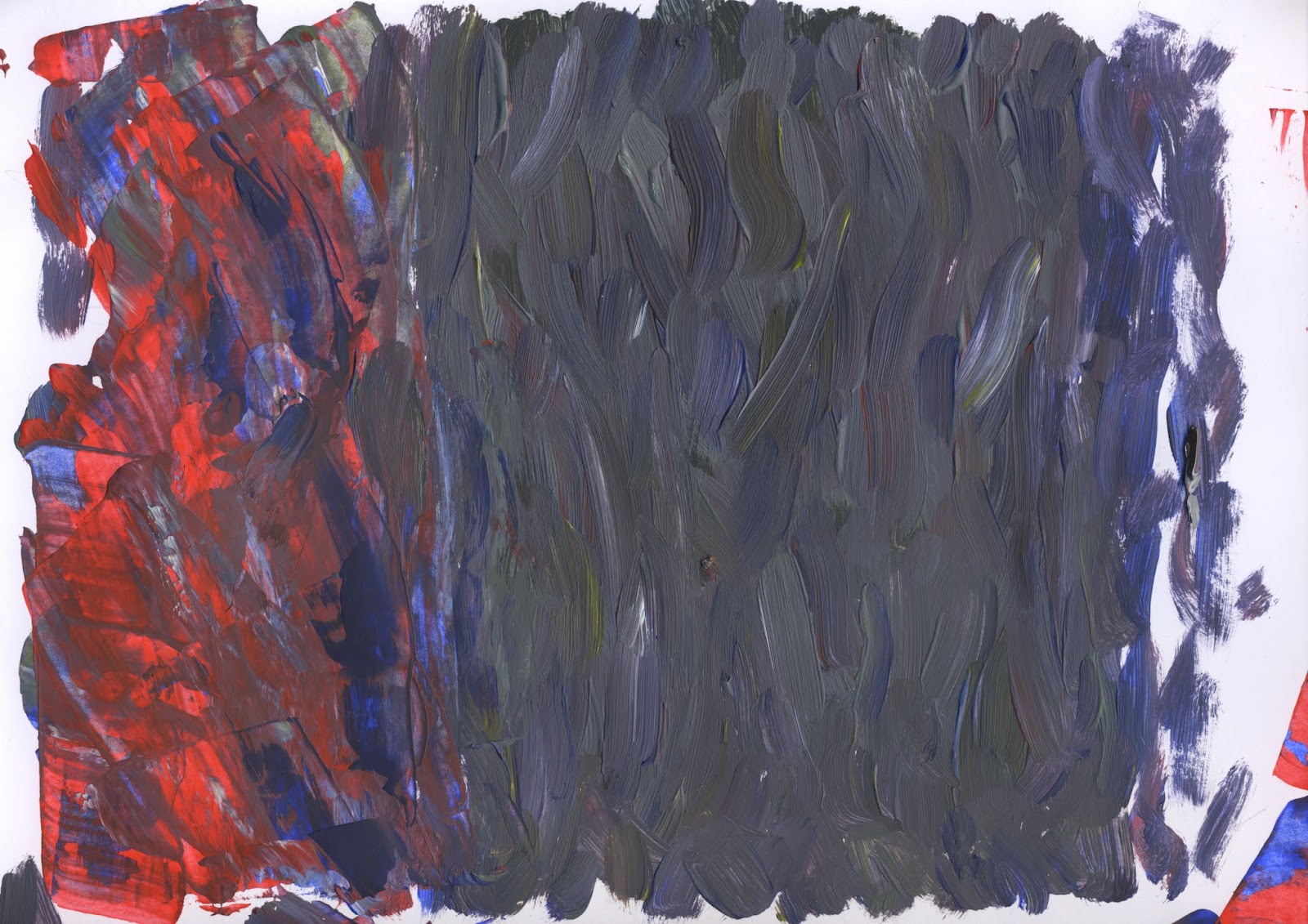

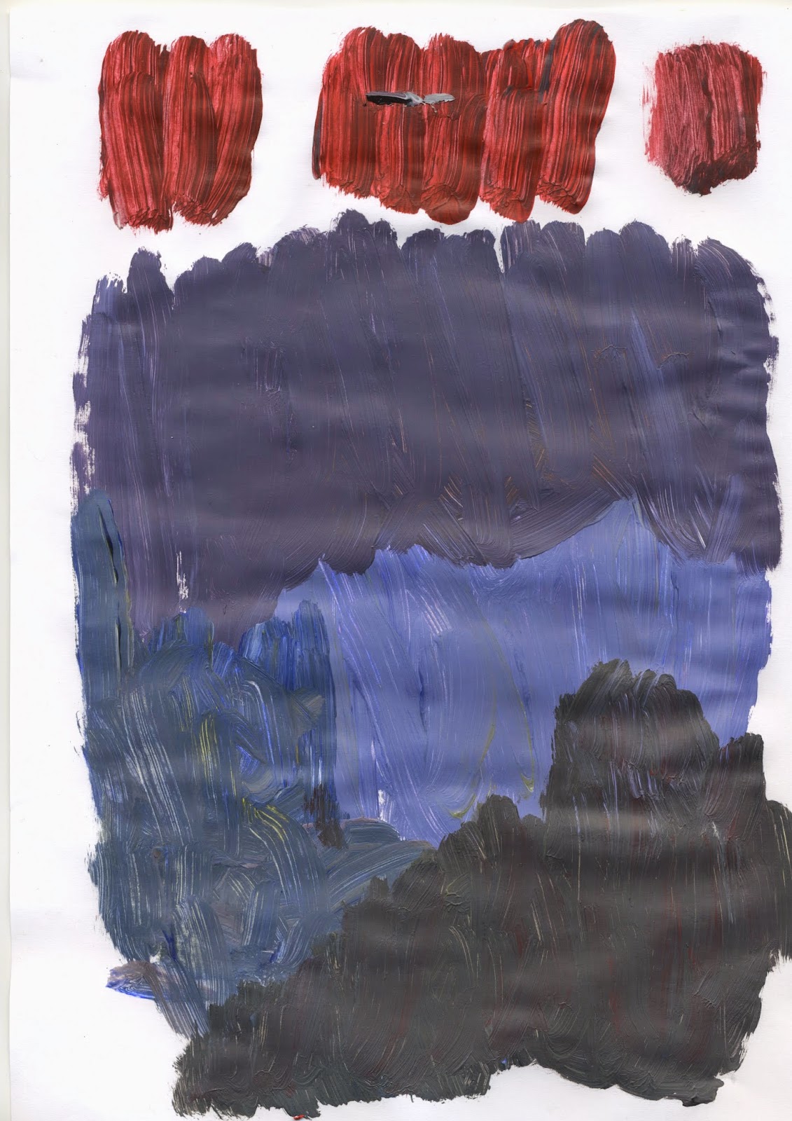

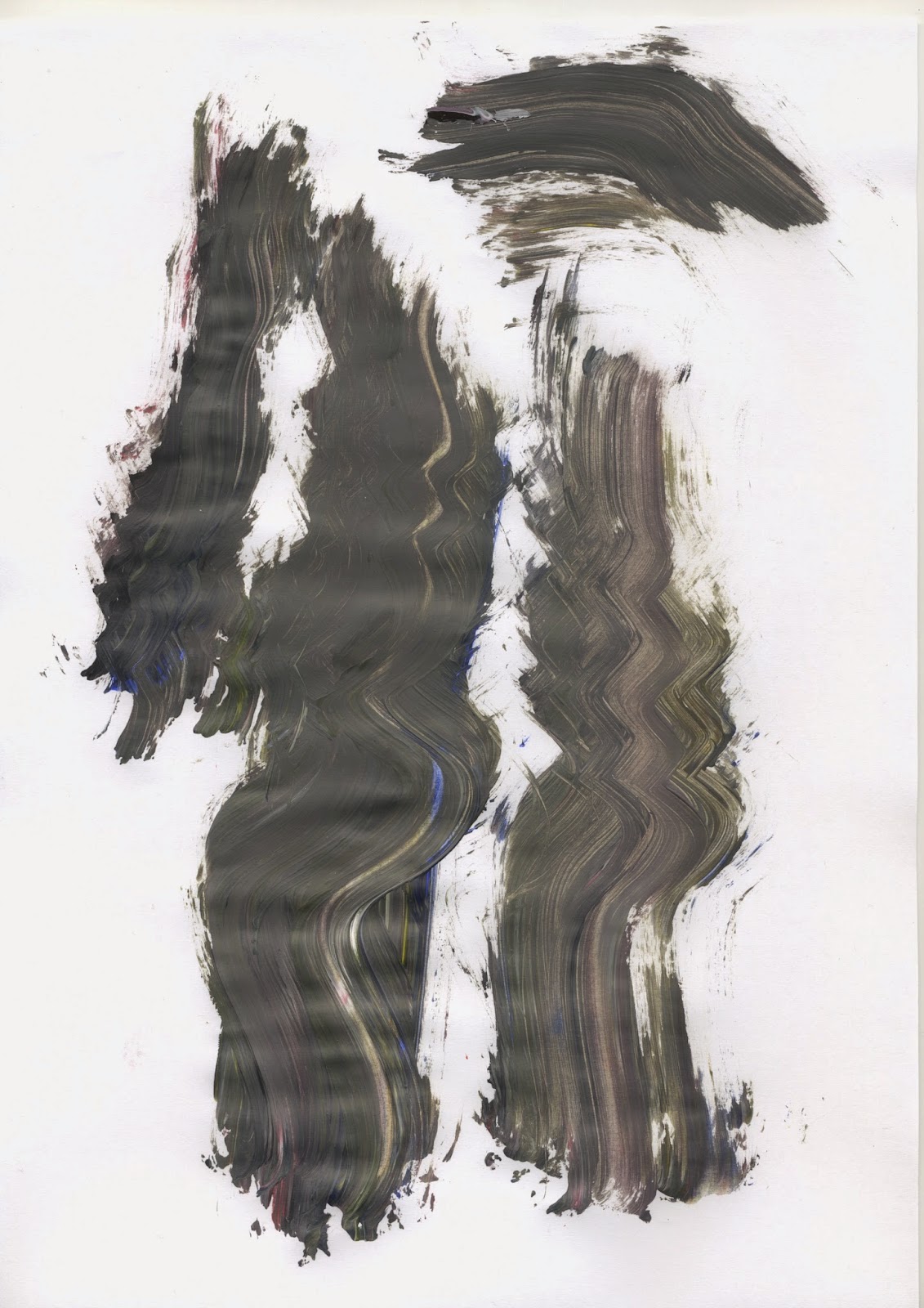

I used acrylic and watercolour paint to create some features that I could use on the advertisements to add an artistic, creative feel.


I also tried out painting some letters to use, as I feel a regular typeface would be quite boring for this.


Friday, 2 January 2015
OUGD504 // Studio Brief 04: Print advertisement research
Posters

Poster for La Guarimba International Film Festival by Aditya Pratama

DJ set poster by


Leaflets for a music festival by Dolores Oliver


Visual identity for Art Walk Mexico by Marta Veludo


Sofia Coppola Movie event branding by Florencia Fuertes

Poster for Pecha Kucha night by Mikaela Lilhops

Coco Rosie poster by Ro Gal
I have chosen these particular designs to take from because I feel each of them is unique and bold. However the 'art walk' advertisements are too full on for my taste,
Thursday, 1 January 2015
OUGD504 // Studio Brief 04: Study Task 13
Print Finishes
Definition:
Finishing is a process applied to a design’s substrate, or surface, that can provide your work with a specific look and feel, add decorative elements, alter its shape and size or provide functionality and presentation enhancements. Finishes can transform an ordinary design into something much more interesting and unique.
production methods
digital preparations
costs
potential uses
include your own visual example.
Varnishes

A varnish is a colourless coating that can both protect the substrate from wear-and-tear and enhance the look/feel of a design, with a glossy, dull or satin finish. An example is magazine covers.
- Gloss — typically used to enhances photographs
- Matte (or dull) — helps improve readability; most used in the interior pages of publications
- Satin or silk — the middleman between gloss and matte; not too glossy, not too dull
- Neutral — used to protect the substrate without the appearance of the varnish
- UV varnish — provides more shine than typical varnish; applied with an ultraviolet light
- Full-bleed UV — very high gloss effect; most common
- Spot UV — enhances specific parts of a design; can create a variety in texture
- Textured spot UV – creates a specific texture; ie: leather, rubber, etc.
- Pearlescent — provides more of a “luxurious effect”
Die Cut

Die cutting is when the shape of the paper is altered or areas are cut out to enhance the visual purpose of the design. Often die cuts are used to see beyond a page and onto the proceeding one.
Embossing and Debossing

Embossing (above the surface) and debossing (below the surface) is a stamping technique in which particular elements are three-dimensional and textured. This technique can be accomplished with or without (blind) the use of ink or foil.
Foil Stamping

Foil stamping, which is the process of pressing colored foil onto a substrate with a heated die, can add texture and elegance to a design. It can also be used as a mirror to show reflections adding to the overall effect of a printed piece.
Fore-edge printing

Printing technique applied to the outside edges of a publication that can give the appearance of color, display words, or create texture (ie: gold or silver).
Subscribe to:
Comments (Atom)