Wednesday, 11 May 2016

Tamar Attia // Business cards - development

I created some variations of business card layouts using Tamar's information.
Tamar specified that she wants the design to be really simple, with nothing fancy. She doesn't have a logo that she uses, so I've tried out some imagery of her work, and also lettering that can be used like a logo.


These two typefaces I've tried out are very simple and quite modern, which I think suits Tamar's style very well. I wanted OCR A Std on the left is possibly a little too cold, as it based on technology and Tamar's work is all handmade and screen printed. It possibly gives off the wrong connotations.

The second font, Orator Std, is a caps only font and is very neat and minimal. As Tamar is looking for something simple, this seems to work well.

Using one of her paint marks as an icon is a subtle way of reflecting her style.


 Here I've used Futura and Gill Sans which are both quite chunky and modern. The front designs I've tried here are her initials, which is a subtle way of creating an identity. I also tried out using a sample of her work to be put on the front, which creates a clear context and serves as a reminder of her abilities.

I showed Tamar these various ideas and she preferred the text being lined up to the left, and liked Futura the most.


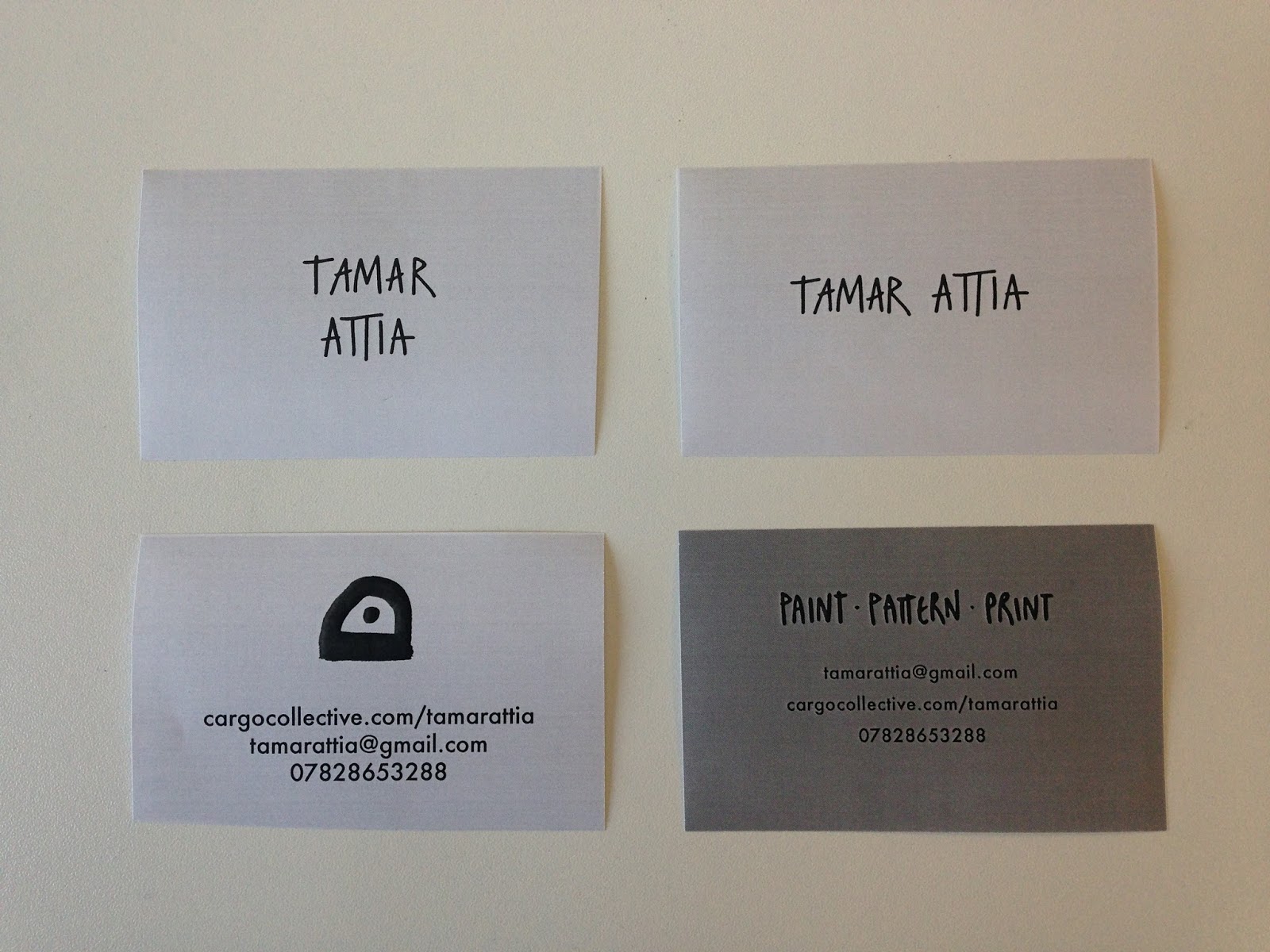
Above shows some changes we made. We talked about how she should give herself a profession on the card, such as surface pattern designer, but she isn't keen on that as its so overused. She came up with 'paint pattern print' which would be an effective way to reflect what she does without restricting herself.
I told her that she should hand render it, to go with her expressive hands on style, just like I've seen her do with her name like so:


We agreed this would look good as a logo, so I asked her to write out her name multiple times, along with 'paint pattern print'.


I organise them in illustrator and picked out which ones were best. I also slightly altered some of the letters to make them neater.


I have tried out different sizes and placements of the hand written type, to show Tamar some possible outcomes to choose from.
I have also experimented with some different colours other than yellow, so we don't jump into our first colour idea. I took the colours from what she uses often in her work.


In black and white I printed out the different variations so I could see how the sizing looks in print form. I have noticed that 'paint pattern print' on the 4th design looks too small in relation to the body copy, it just doesn't sit right.
When I showed the designs again to Tamar, along with the printed versions, she wasn't keen on her name on its own - it looks too bare and maybe too small. She much preferred the paint blotch logo with her name underneath, as it reflects her the best and makes for a strong visual, but wants to make the type smaller. She also wants the body copy centred underneath 'paint pattern print' on the back, rather than to the left, as that looks the neatest. She still prefers the colour yellow.


These are the final designs we have agreed on - the yellow will be a coloured stock hopefully the closest to a yellow-orange colour.

Tamar Attia // Lookbook - ideas

We had a more detailed discussion of what she wants:
  • she wants to take the fashion route with her work, so it will have to cater to that industry
  • patterns overlapping, but also some blank space too
  • a mixture of photographs, scans, positives, fashion illustrations

After this discussion I did some sketches of different ideas of layout, and showed them to her at a later time.


  • her contact details could be on the back page, and a brief introduction in the front.
  • the outside of the booklet could be a brightly coloured stock, to contrast with the white stock that will be inside. this bright colour could be a colour commonly used in her designs.
  • the outside of the booklet could also have a belly band around it, or cut different from the rest of the paper to give it a creative look.


I created some prototypes so I could see how they are when printed.

front
back
Having a cutout feature on the outside of the booklet will give it more character, which is what Tamar is looking for. I found that some of these work better than others; having a cover with just her prints seems a little unnecessary seeing as her work will be inside.

I showed these to Tamar and she really liked the belly band and top right design - if it was a brightly coloured front flap on a white stock or a different colour, it would really pop.


This is a collage Tamar made based on what kind of layout she'd like for some of the pages - very cutout and busy. This features a scanned print, an illustration, and a sample of different colours.


Tamar said that she would actually like the book to be square shaped - as to make it a little different from portrait sized. As for measurements, she is thinking A4 sort of size - so that everything can be seen clearly and there is enough room for the illustrations.


We made some prototypes of the size, using an A3 piece of paper. She said that it was still felt like it wasn't big enough for the illustrations, so we made (on the left) the prototype a little taller, so not an exact square but the space made a lot of difference. The measurements we are happy with are - 21cm x 20cm. This leaves enough room for a bleed when printed on A3.


In indesign, we tried out a basic version of what we are thinking for the front cover.


I suggested that on the cover we could use some of her black negatives, which tells a story of her hands on process.

Cut out cover


With a cut out cover, the negatives could be on the white stock underneath, meaning the yellow will stand out more on top of it.


Belly band


A belly band will make it more complicated to make, but it makes it seem more special and more of a package.

Friday, 6 May 2016

Zine brief: ideas and inspo


Selected Sketches, Thomas & Jurgen

Dutch design studio Thomas & Jurgen has produced a threesome of zines for their third instalment, all exploring varying iterations of “three”. Providing engaging insight into the development process of creative projects, Thomas & Jurgen’s trident of Selected Sketches zines takes symbols read as “three” and demonstrates how sketching is integral to the creation of a unique design by articulating and answering provocative questions in a visual format.

In the third edition of Selected Sketches we examine symbols referring to the concept of 'three'. The zines '3', 'III' and 'Δ' provide an insight into sketches that often arise outside our sketchbooks. These sketches regularly consist of spatial experiments, collages, paintings and photographs. By choosing a simple starting point for this process, we challenge ourselves to review and reshape the obvious.
'Three' gives an insight into the infinite possibilities of experiment and shows an important part of our search for new visual languages, materials and ideas.


Pentagram partner Marina Willer has created a new book of rubbings of London drain covers, entitled Overlooked. The publication forms the agency’s 45th Pentagram Paper, and comprises 22 rubbings taken of London’s street covers “from Islington to Kensington” alongside an essay by Willer.

According to Pentagram, the tome “tells the history of London through street covers, outlining the vital roles that each piece of street furniture had in serving Londoners” and “serves as a reminder that a city’s beauty isn’t limited to art galleries or grand architecture, and that intricate design is everywhere.”


http://www.itsnicethat.com/articles/matthew-brown-orientation-100216


Kiss Me I’m Dying, Brad Philips

Published by Stanley/Barker, Kiss Me I’m Dying draws from “a vast trove of cultural detritus – the tongue-in-cheek slogans of bumper stickers and needlepoint pillows to the sardonic quips of a misanthrope.” The slogans become almost like images, in their cursive style and scale shifting from “Fifty Shades of Greige” to “I Had the Time of Your Life.”


 http://www.sofiaclausse.com/Windy-Zine-City


Zine created as a response to my visit to Chicago, the "windy city". The distortion of the building windows and the Cloud Gate sculpture served as inspiration for the warped images and type. 


http://thebookdesignblog.com/book-design-inspiration/simona-noli-hand-bound-books?utm_source=feedburner&utm_medium=feed&utm_campaign=Feed%3A%20TheBookDesignBlog%20%28The%20Book%20Design%20Blog%29


https://www.behance.net/gallery/26304781/VOW_Philia


https://www.behance.net/gallery/9351721/portfolio


https://www.behance.net/gallery/23334561/Recall-Collages


Oliver Jeffers


Alec Soth


http://www.itsnicethat.com/features/fletchers-sketchbooks-an-exclusive-insight-into-the-sketchbooks-of-the-late-great-alan-fletcher


http://www.cromerdesign.com/pyr-ro.html


http://www.hamburgereyes.com/