Saturday, 19 October 2013

Studio Brief 2: Illustrator

For Brief 2 I have to choose a letter from the set of 10 letterforms I created based on the word 'nobility', which were manipulated from Garamond Bold.

[ http://s-mcdonald1316-dp.blogspot.co.uk/2013/10/brief-2-alphabet-soup-final-nobility.html ]

I thought about choosing the 'J':

But I was told in the crit that it wouldn't have the same impact when just in black and white; I won't be able to use the blue, which is a huge part of what the letter is standing for (blue blood).
I was also told in the crit that the letter 'A' that I manipulated would work better as a whole alphabet, as it is very clean cut:

It could also be applied to every letter of the alphabet with no restrictions, whereas the droplet in the 'J' may prove to be difficult when designing the other letterforms. I also am restricted with time for this brief so a straightforward solution would help.

Friday, 18 October 2013

Studio Brief 1: ALPHABET - Final Crit

We had a final crit where we had to talk about our work and receive feedback. Here is mine:


  • Most people agreed that the 'A' would be the easiest to develop a whole alphabet from as you can always cut a letter into three parts. I'm not sure how whether to choose this letter as I feel it's a bit too straightforward and simple, and without colour there is a chance that it doesn't have the same effect.
  • I said that 'J' would be my ideal letter to develop on illustrator, but the blue drop of blood would apparently not work the same in black and white.
  • The 'Q' is my favourite, and the feedback I got on it was that it is creative but wouldn't work when making an alphabet.
  • the 'O' looks like a C because of the curling banner at the bottom.
  • However, it is very clear as to what it is representing.
  • If the letter 'O' was to be developed into an alphabet, then the crest feature would have to be more subtly used.

Thursday, 17 October 2013

Studio Brief 3: Matthew - Fonts


I have asked him more questions than were on the sheet so I can get to know more of his personality, in the less obvious senses. From having simple chats with Matthew I have discovered that he is very jokey and his sense of humour is a large part of his personality.
Because of this I want to pick a font that isn't formal, and reflects his lack of seriousness. However he says that he is quite cynical and pessimistic, so I don't want to manipulate a font that is too wacky or jokey, as there is more personality traits than that.
Looking through the font folio, the following fonts caught my eye:
Arial Rounded MT Bold

Gill Sans
Gill Sans bold

Cooper Black

I'm not sure which to use out of these yet, as I think they are all quite reflective of Matthew's personality without giving too much away (meaning I can manipulate them and do this myself).
However, I definitely prefer the bold version of Gill Sans over the regular version, as it has more to work with, I feel like the regular is too plain and lacks any characteristics.
All three fonts that I am trying to choose between are relatively bold, which I think reflects masculinity and possibly pessimism, which is connotated with Matthew's personality. The simple anatomy of the letters reflects Matthew's simple likes and dislikes and his comfort zone.
The soft edges of Arial Rounded MT Bold and Cooper Black are more suited to Matthew as he is a friendly character, and he isn't very serious in his mannerisms and has been described as quite childlike. If I picked Gill Sans bold I would want to soften the edges of the letters.


Studio Brief 1: ALPHABET SOUP - Further development - 'N'

I've decided to develop the letter 'N', as the crossbar stands out to me as a part that I could use to my advantage. 'Nobility' reminds me of knight and armour, which is linked to the royal family and general patriotism. From this I've taken weaponry, and sketched a sword in the place of the crossbar of the 'N'. I'm not sure whether to make the sword slimmer so it isn't so bold against the stems of the N but it fits perfectly as the crossbar.


I don't want to make the sword any more detailed as I prefer it to work very simplistically. I may decide to fill it in with silver for my final design.

Wednesday, 16 October 2013

Studio Brief 1: ALPHABET SOUP - Further Development: 'O'

I've chosen the letter 'O' as I think that I could incorporate parts of a crest into it. I researched crests by looking at images of them, such as this:


I think that the image on the left is quite detailed and complicated, whereas I want to keep my designs quite simple. The one on the right seems more suitable for the letter 'O', as I can incorporate the leaves into it.


I've found a black and white version so that i can look at it in a more simplistic manner. I want to only make half of the letter part of the crest like below:


I like this design as the O makes the rest of the shape without having too much detail. I may add hints of gold or silver for the final letter.

Tuesday, 15 October 2013

Studio Brief 1: ALPHABET SOUP - further development - A & Z

W/A
  • I previously created the letter 'W' with the idea of a hierarchy - I did this by splitting it into four parts. After the crit I decided to use this idea with an 'A' instead, as hierarchies are generally shown in triangles.

  • However I have now broadened my research in the idea of hierarchies and found that the hierarchy of social class is based around nobility and how the nobility is part of the upper class and always has been. The social class is primarily split into three parts - The lower class, middle class and upper class. So I have changed the four part 'A' into a letter with 3 parts instead.
Z

  • I want to reflect the crisp perfectness of the upper class and the trodden on, scruffiness of the lower class - how they are percieved in society.
  • I've carefully drawn the top half of the Z with a quick sketch of the bottom half to represent this.
  • I want to fill in the stop half of the Z to show the completion of it and how it is all in place like the upper class.


OUGD404 - Design Principles: Font task

Today we were introduced to a new module, 'Design Principles'. We were set a task to choose 3 fonts  with distinctly different characteristics from one another and print them to fit into 10cm x 10cm squares as individual letters. The chosen letters have to be A B C X Y Z and a b c x y z  for all three fonts.

The fonts I have chosen are:
Bauhaus 93
Colonna MT
Edwardian Script ITC
I chose these three fonts as I think they really differ from one another. The first, Bauhaus 93, derives from the Bauhaus movement in the 1980's which was very influential in the design world. The letters are thick and curvy. It has a particularly retro feel to it.
Colonna MT is pretty looking, modern and easy on the eyes as the white space within the lettering adds it's own personality.
Edwardian Script ITC is amazingly elegant and traditional, and it would be used for a completely different target audience than the other two fonts, for example wedding invitations or something very formal.

Saturday, 12 October 2013

Studio Brief 1: ALPHABET SOUP - Interim Crit


Interim Crit

Today we had a crit in groups of 12. We each took our turns to present what we had come up with so far and what our word/font was. I found this session very helpful as its always a good idea to have an outsider examine your work so that you have a brand new perspective. Below are some suggestions I got given.
  • Use the letter 'A' for hierarchy instead of 'W', as it goes from small to big like the triangle of the hierarchy as demonstrated below. I was also told that the triangle of hierarchy is normally split into three parts, however I found with some research into different hierarchies that they can differ greatly. The triangle I found shows the different classes and their positions in society because of their privilege.
  • Some other feedback I got was that the noble people of high class would use unordinary processes, and lower classes would use very average processes. This applies to everyday life with different levels of privilege.
  • So if I was to reflect this in my lettering, I could use mediums that are not ordinary and average. For example, gold foil or embossing. If not, then I could use gold or silver colouring in my designs very easily.
  • I could use different processes in my work, to reflect different classes so that nobility is made clearer.
  • Crests are a big part of royalty, which I could do some research into.

Thursday, 10 October 2013

Studio Brief 1: ALPHABET SOUP - further development

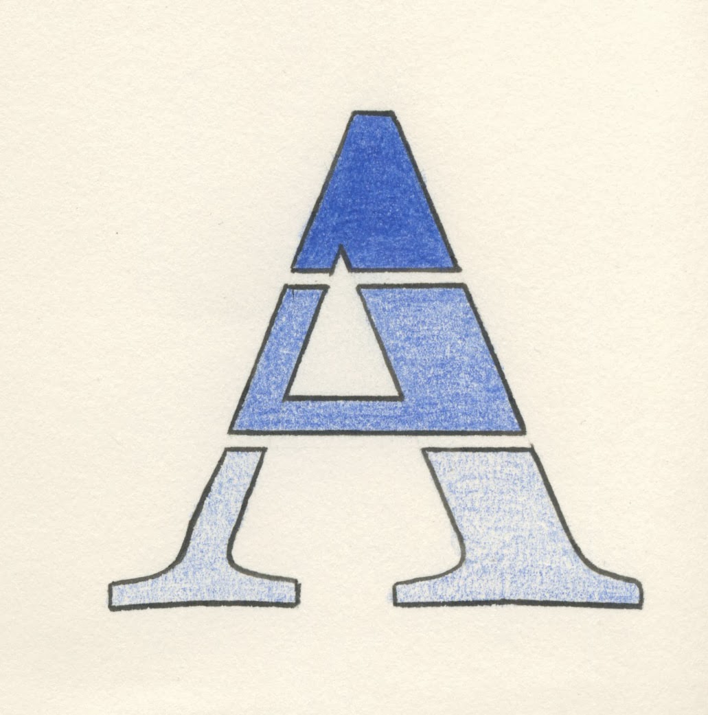
I've decided to use the bold version of Garamond because it will give me more area to work with and manipulate. I also prefer how it looks; it seems more sturdy and stronger than the original which is below:


I decided to print out all 26 letters of the alphabet in both lowercase and uppercase, just so I could trace them and get a feel for them by drawing some ideas using them as templates. When tracing the lowercase letters, I realised I didn't want to use them for this brief. I thought sticking with uppercase letters would suit the theme of nobility, as they are sturdy and large and more important looking than lowercase. UPPERcase is upper, LOWERcase is lower, which reflects the hierarchy that is involved in nobility in a certain sense. The royal family are noble and are UPPER class.


I also think that the upper case is more consistent and aesthetically pleasing when creating a set.

  • O - I am thinking about adding the England flag to the O, as nobility is linked to royalty and the upperclass, and I live in England so it is linked to our royal family and overall Britishness (although England has more power than Wales or Scotland, thus why I would choose the English flag.)
  • P - I added lines coming out of the P, to show power, as the lines are like light shining through, or the sun. To make it part of the actual letter, I have made the lines part of the actual shape instead of just being attached to it. Nobility has a lot to do with power in society, and more powerful people have higher levels of nobility and status.
  • Q - I thought that the queen's face on a coin would reflect money in society and how the upper classes own a great deal of it, including royalty. They are so highly contrasted with the lower realms of society. Also, Q is for Queen.
  • R - I added a symbol of a dazzle that comes from jewels, to signify royal wealth.
  • Y - I experimented with adding pearls to the letter as the women in the royal family are known to wear pearls throughout history.
  • X - I won't be using this letter, but I tried to experiment with the size of the bottom half of the letter to show the top is bigger and better like the hierarchy. I don't think it works or portrays what I was thinking of.
  • W - With this letter I thought I could represent the hierarchy of social class. It shows different levels of the system. I like this because it is subtle and easy to read.


These are the ten letters that I've picked, however they aren't set in stone at this point. I chose them while I was coming up with ideas which seemed to fit well around them. I may experiment with other letters also.


I did some further research into the word "nobility" that I have been given for this project. I found it is associated with the British Aristocracy which was one of the most successful power elites in the world, and comes from a greek word. British nobility shaped the history of the country, and 'noble' titles include Duke, Earl, Baron, Lord, Lady, Master, Sir.
To sum up, nobility reflects royalty, hierarchy, and privileged people. From this, I wanted to create letters that reflect these types of nobility.

Wednesday, 9 October 2013

Taking care of your valuables: HOW TO LOSE YOUR SHIT - Final products


Page 1 & 2 of booklet
Page 3 & 4 of booklet

Page 5 & 6 of booklet

Back page of booklet
Stickers for the "Track your shit" app
Side 1 of keyring
Side 2 of keyring

Sticker for keyhole of the student's front door

Poster included in the package

Layout for final photographs of our work


Friday, 4 October 2013

Taking care of your valuables: HOW TO LOSE YOUR SHIT - Design development


Ideas for keyrings
We want to use simple imagery and text on some small key rings. These will match details that are in the booklet. We'll narrow them down and only print two of these to show in our presentation. We may make them smaller (around 30mm x 30mm) so that they work better on a key chain and fit into pockets etc better.
Sticker development 1
Sticker development 2
Further sticker development
We think that these three sticker ideas were the most effective, particularly the top right one. The imagery being in all black works the best.
Sketches for the "how to lose your keys" page to be included in the booklet

As a group we decided that these images can be developed further on illustrator to be used in the booklet as a sarcastic way of telling students how you can easily lose keys.


Envelope front
After the group crit we improved the envelope design by using both Langdon and Bebas Neue. "Shit" is in Langdon to emphasize the word and its importance, and "How to lose your" is in Bebas Neue. It is still clear but the swearword is what we are using to get the attention of fresher students at first glance. [the critisicm we got said that using Langdon for all words is too unclear]
We also lowered the amount of times the word "shit" is in the booklet while still keeping it in titles.

Taking care of your valuables: HOW TO LOSE YOUR SHIT - Group crit

We joined with another group to have a group crit. We talked about how our brief is developing and explained our reasons for using certain features.

  • We were told that the use of 'shit' is really effective for a student market, but it is overused in the booklet. Reading it too often is an overkill and I think it normalises it so it loses some of its taboo. 
  • We talked about why we have picked a traditionally brown envelope and the context they are usually used in: formal letters in schools and places of work.


Envelope idea

  • Some other feedback was that we could use the little keyhole symbol as the "i" in shit, or the full stop in an exclamation mark at the end of "shit". However, we have already tried the "i" and it doesn't work.

Envelope idea
  • The other group preferred the above envelope as it is more clear, bold and more eye-catching. It's also very large text.
  • We noted the pointers and criticism down and will try to improve our work from it.

Thursday, 3 October 2013

Taking care of your valuables: HOW TO LOSE YOUR SHIT - Design ideas

We paired off to work on small areas of our project. Me and James have started to work on visual ideas for the statistics to be included in the booklet. These facts are:
"Leeds has the third highest burglary rates in the whole of the UK."
"20% of all student robberies happen in the first 6 weeks."
"One in three students are victims of crime."
We are wanting to use very simple diagrams, like graphs and pie charts. For the first stat we thought we'd just use text and use red to embolden some important words to make them jump off the page.
We've created a bar graph and line graph for the second statistic, we are unsure which to use.
For the third stat, we will use a pie chart as it works well with it being a third. It's really simple and easy to understand.


We want to use red, white and black to signify danger and to keep it extremely minimal and simple, also straight to the point. The capital letters throughout make it seem urgent and important.

Planning of the booklet and where the stats will be put


Wednesday, 2 October 2013

Taking care of your valuables: HOW TO LOSE YOUR SHIT - Envelope ideas

Alex made some simple prototypes of how the envelope including the information could look. We want to use simple and bold font to get the point across loud and clear. I also think that minimalism is such an important tool in graphic design.

Front of envelope idea 1

Back of envelope idea 1

Front of envelope idea 2 (back is blank)

Front of envelope idea 3

Back of envelope idea 3

I think these ideas are really effective. The fonts used are Langdon and Bebas Neue, which are bold and clear. Langdon has a really nice shadowing effect which makes more of an impact on the page.  Back of envelope idea 3 doesn't work that well as its portrait and the front is landscape, they don't match up.
I think Back of envelope idea 1 is really nice, but would look better bigger. The front of envelope idea 2 is everybody's favourite that we will be developing and moving forward with.